Meezan Bank
Reimagining the mobile banking experience for one of Pakistan's largest Islamic banks — clarity, trust, and effortless daily use.
Identifying the UX Friction.
Design without research is just decoration. To ensure the redesign effectively addressed the gaps in the legacy application, we conducted deep-dive interviews across the Meezan Bank user base.
The research revealed that users didn't just want a "prettier" app; they demanded a fundamental shift in how they accessed their financial data.
Information Hierarchy
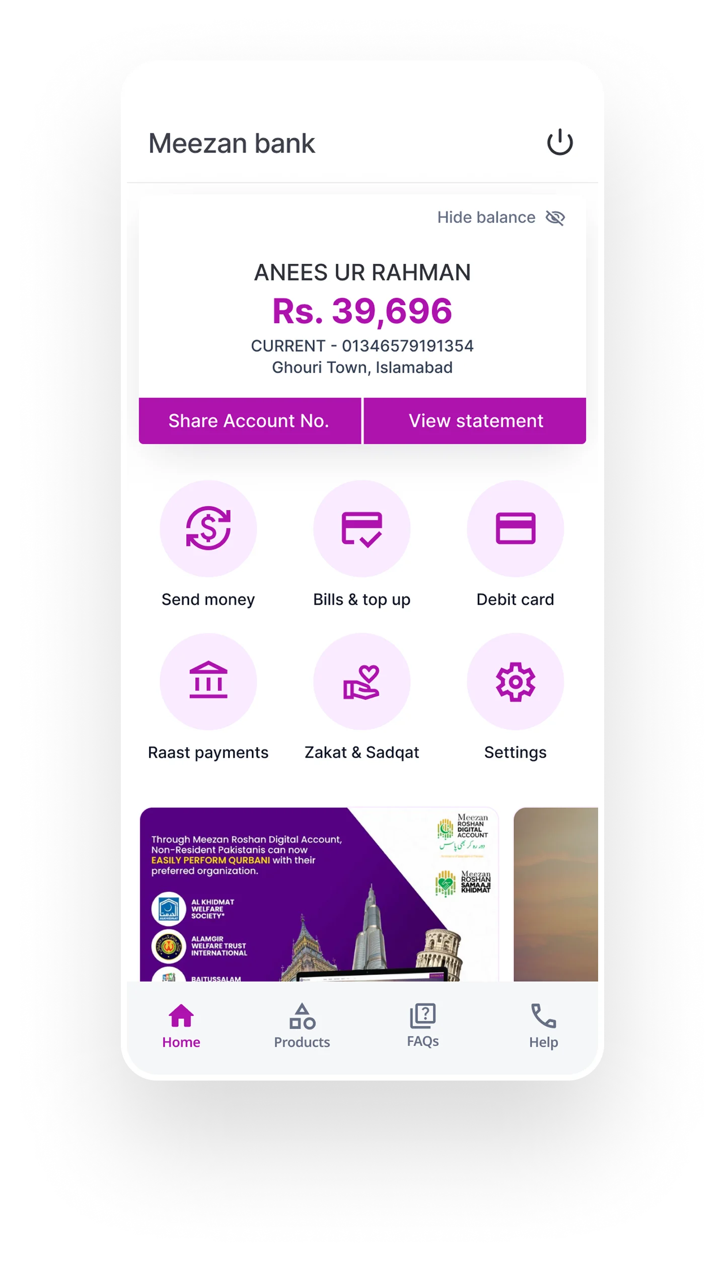
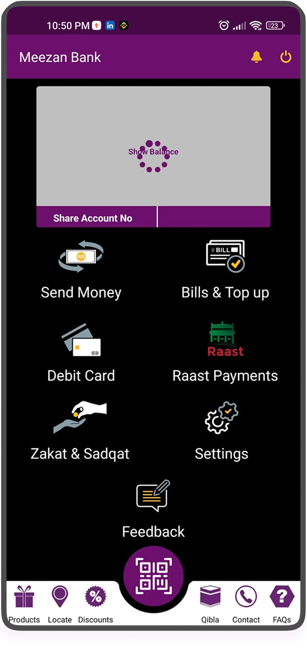
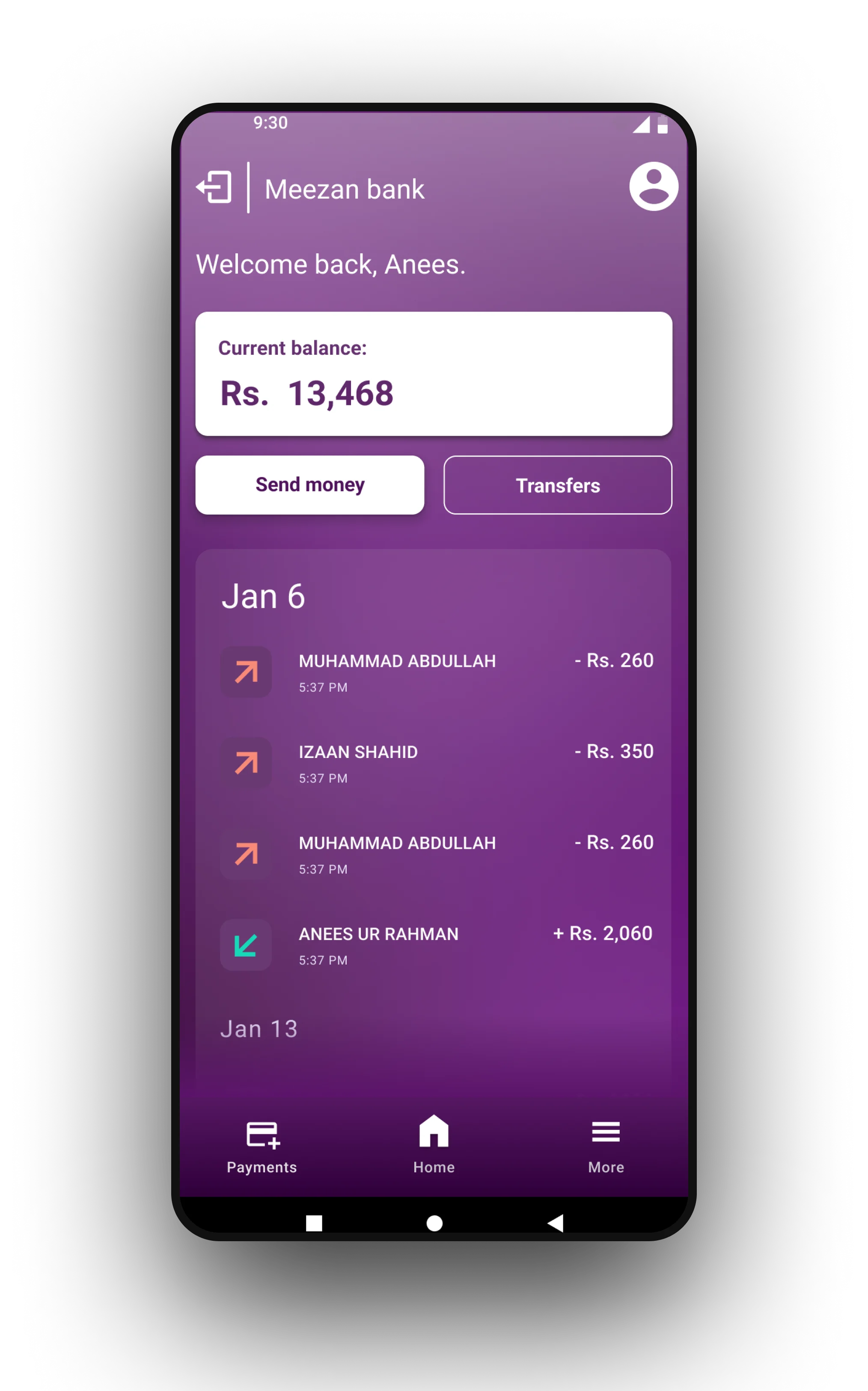
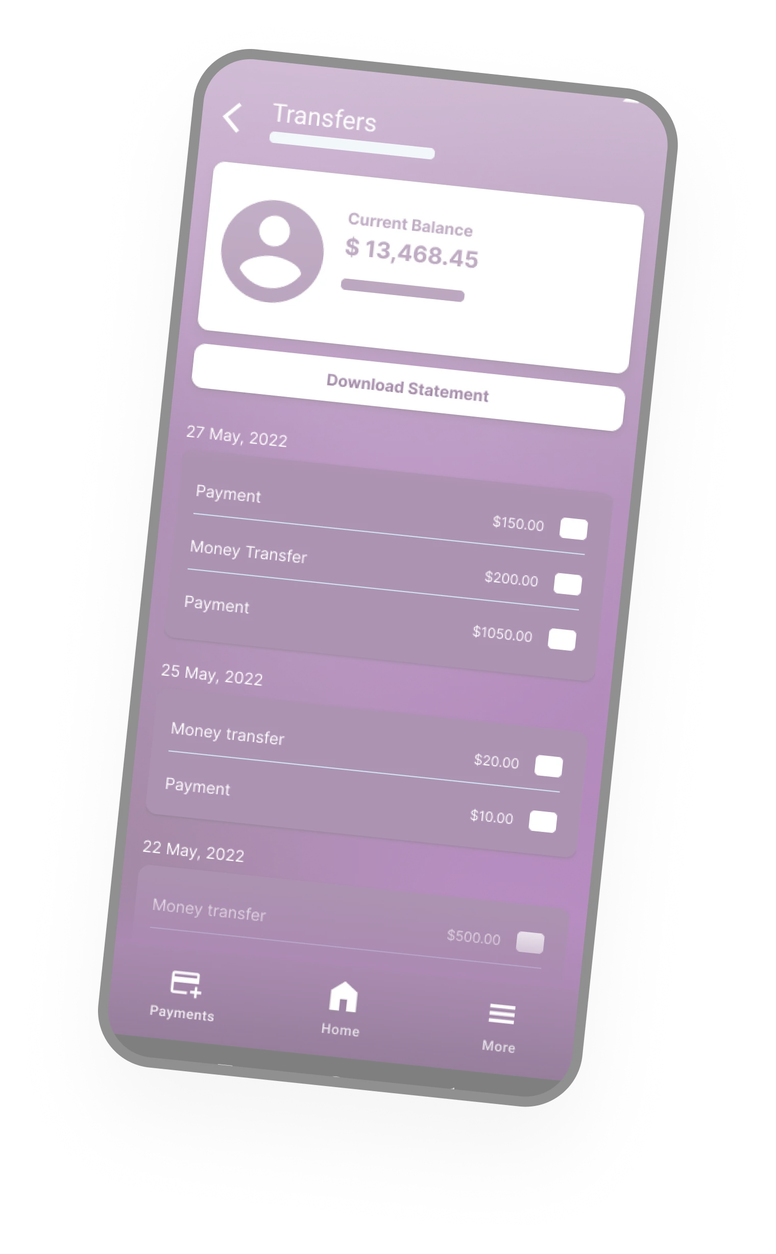
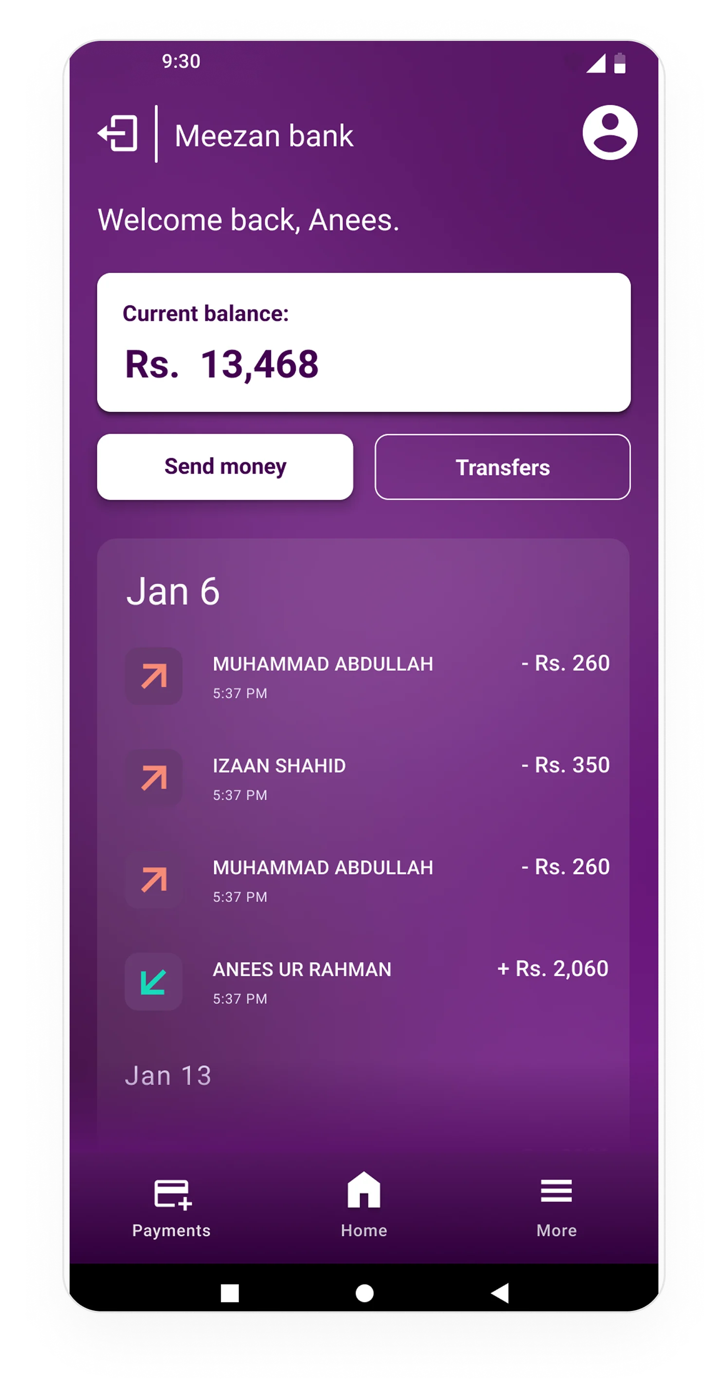
Users felt overwhelmed by the cluttered legacy dashboard. The primary request was a clean, minimalist design with ample white space, allowing them to focus entirely on balances and quick transfers.
Biometric Security Integration
In the modern fintech landscape, passwords create friction. Integrating native facial recognition and fingerprint scanning was critical for maintaining trust while speeding up daily logins.
Transparent Communication
Addressing user anxiety around hidden fees was paramount. The UI needed to surface pricing and transfer fees immediately within the transaction flow, rather than burying them in terms and conditions.
Structural Wireframing.
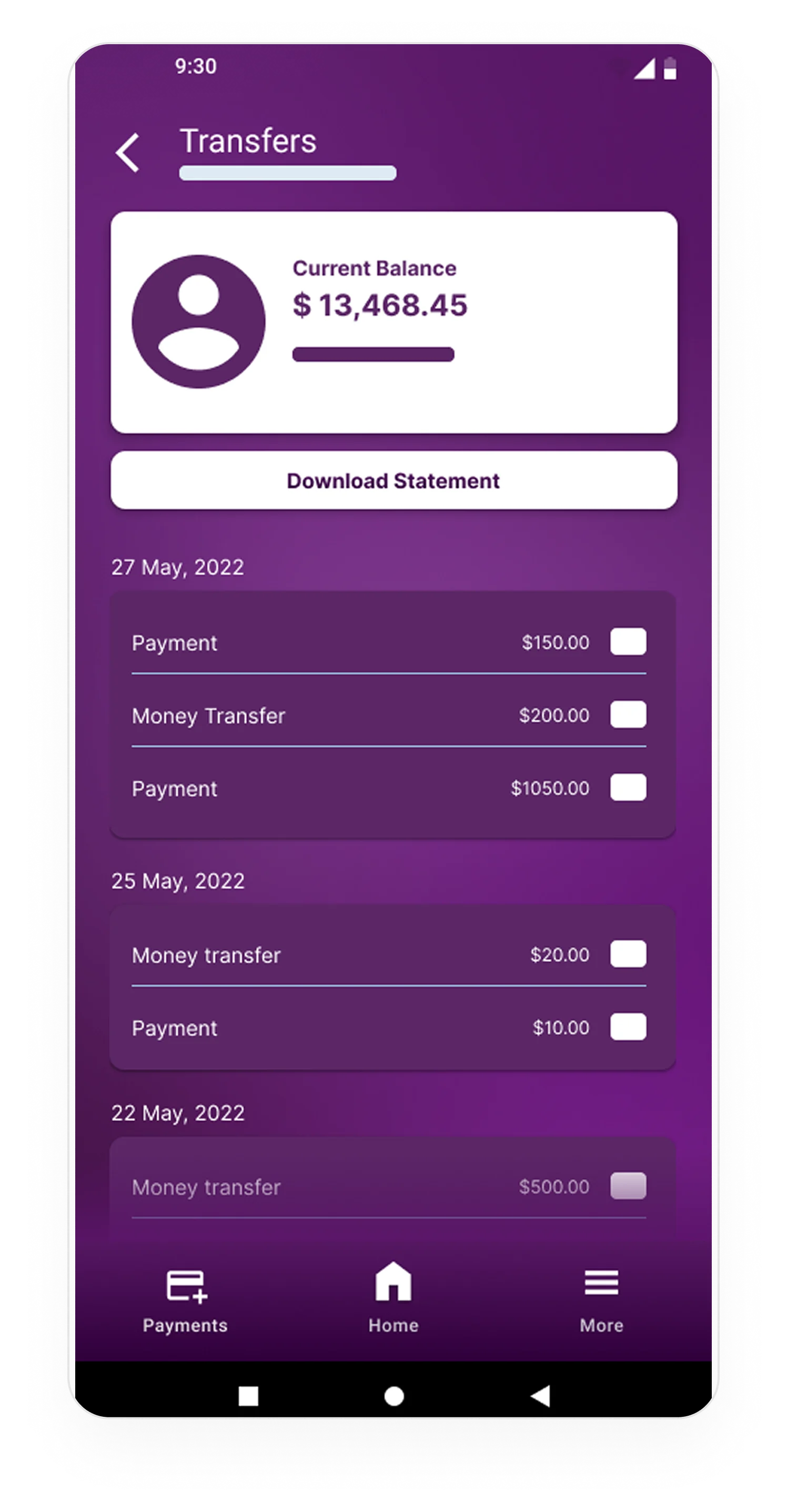
Before applying high-end visuals or brand colors, rigorous low-fidelity wireframing was essential. This phase allowed us to aggressively test the application's structure, ensuring that core utility features—like fund transfers and statements—were accessible within a maximum of two taps.

Frictionless KYC.
Onboarding is where banking apps experience the highest drop-off. By breaking the intimidating document scan and biometric process into a fluid, single-task-per-screen flow, we drastically increased conversion rates.
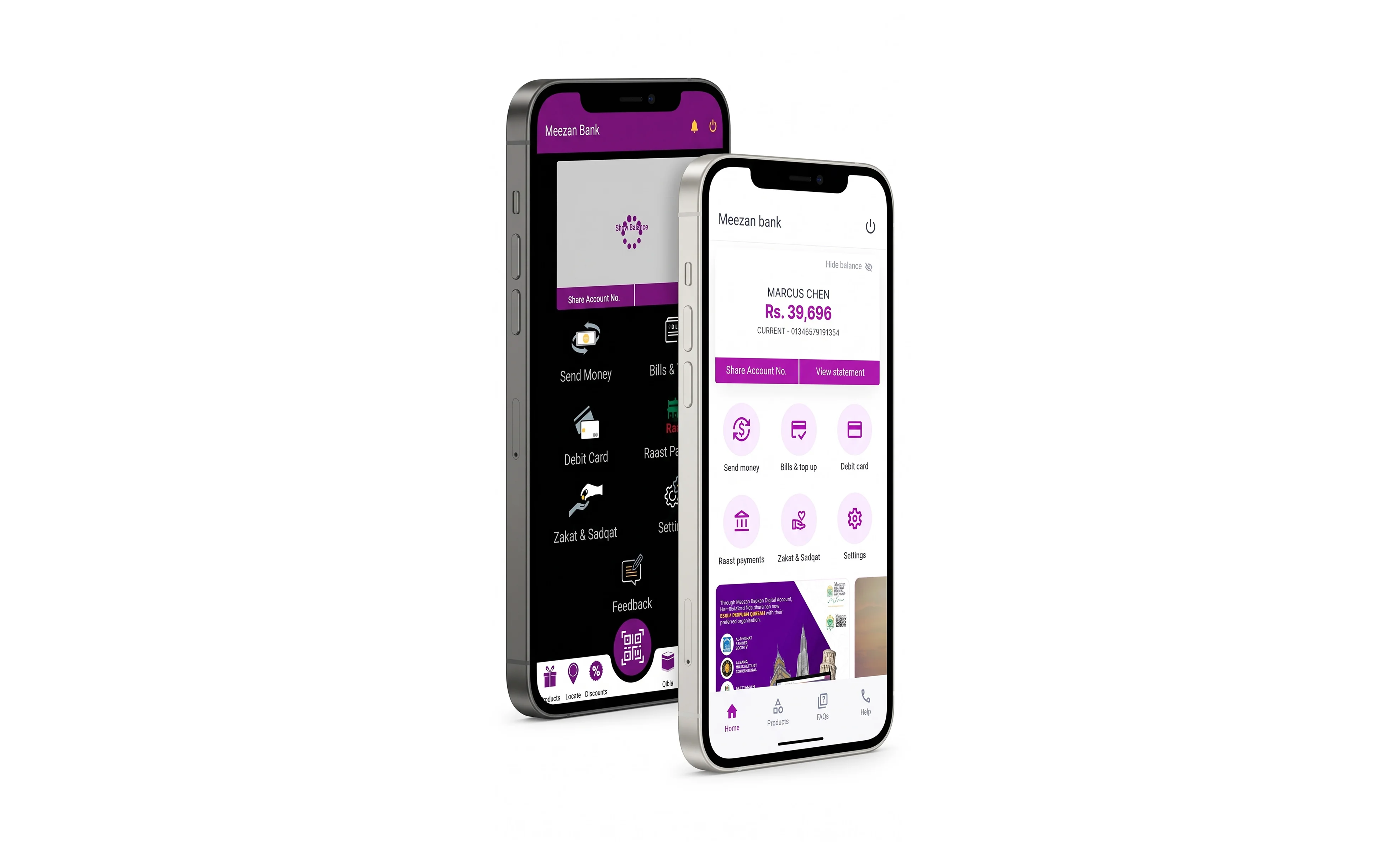
Escaping the legacy grid.
The previous application overwhelmed users with aggressive colors and unstructured data. Our strategy was to strip away the noise and focus entirely on spatial hierarchy and immediate access to funds.
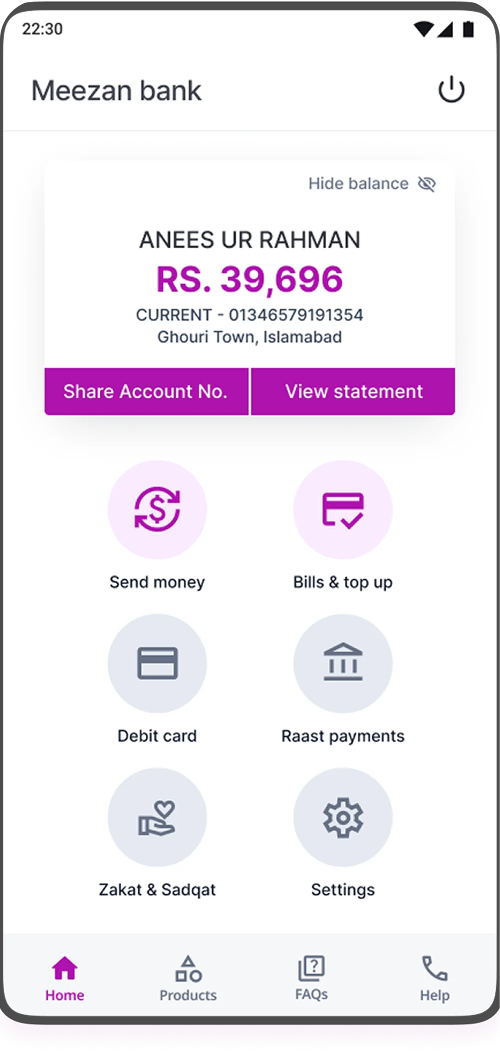
Information Architecture
Consolidated account viewing with a sticky bottom navigation bar to keep primary actions thumb-accessible, eliminating the need to dig through hamburger menus.
Premium Fintech Visuals
Shifted to a high-contrast, card-based UI. We established a strict color logic where Meezan's signature Emerald dictates success and growth, replacing the previously muddy palette.
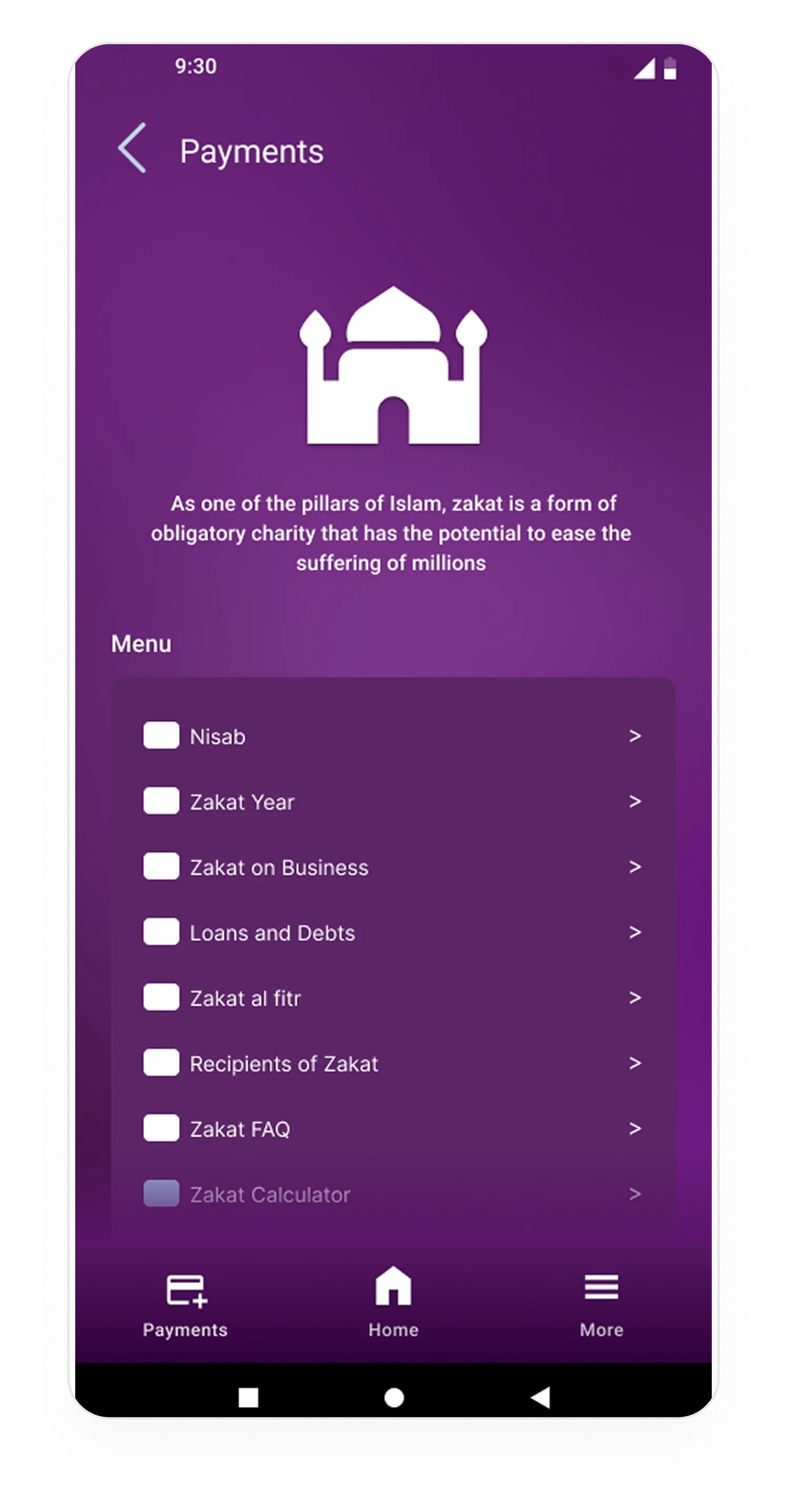
Active Lead Generation
Integrated frictionless onboarding flows for secondary products (like card requests or limits) directly into the dashboard context.
A New Standard.
By applying rigorous typography, custom iconography, and a disciplined color system, we transformed Meezan Bank's digital footprint from a legacy utility into a premium financial experience.
Architecting the journey.
Banking apps are purely utilitarian. We mapped the most critical user flows and engineered the UI to radically reduce the number of taps required for execution.
Key Metric
−40% Taps to Transfer
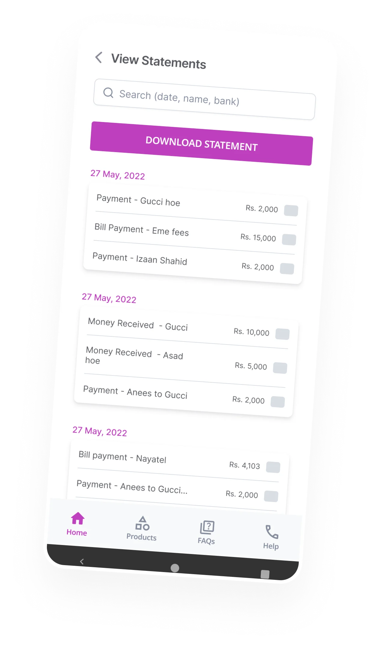
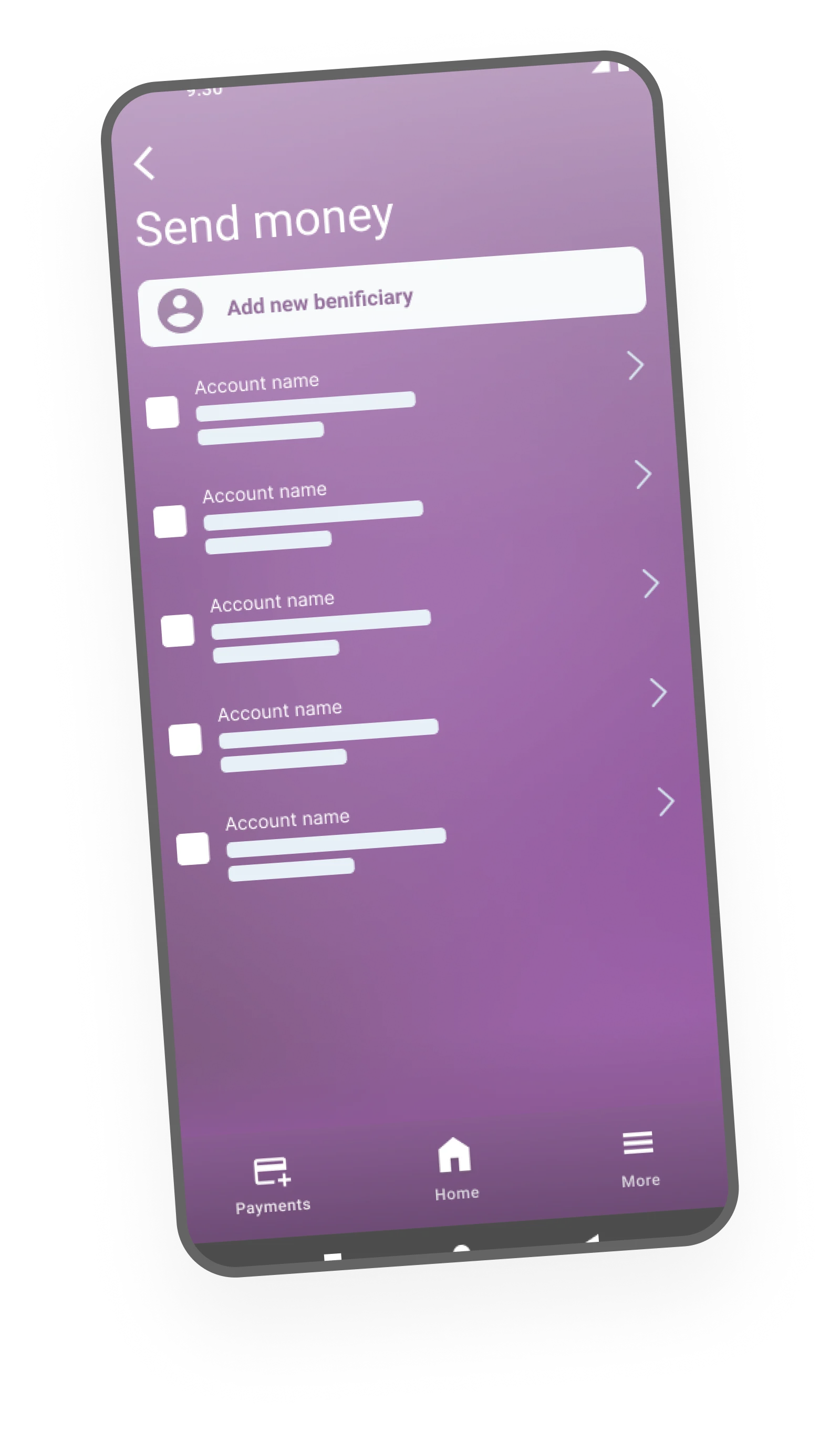
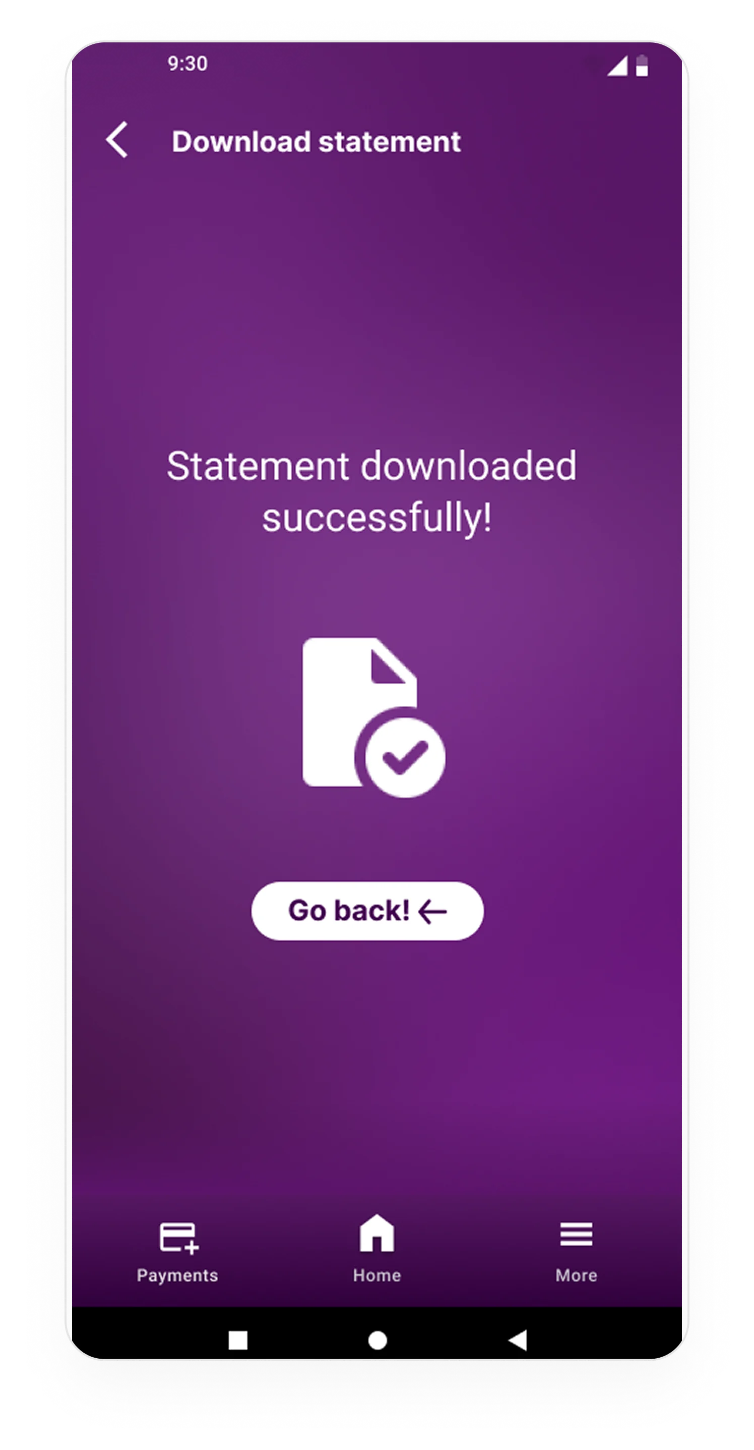
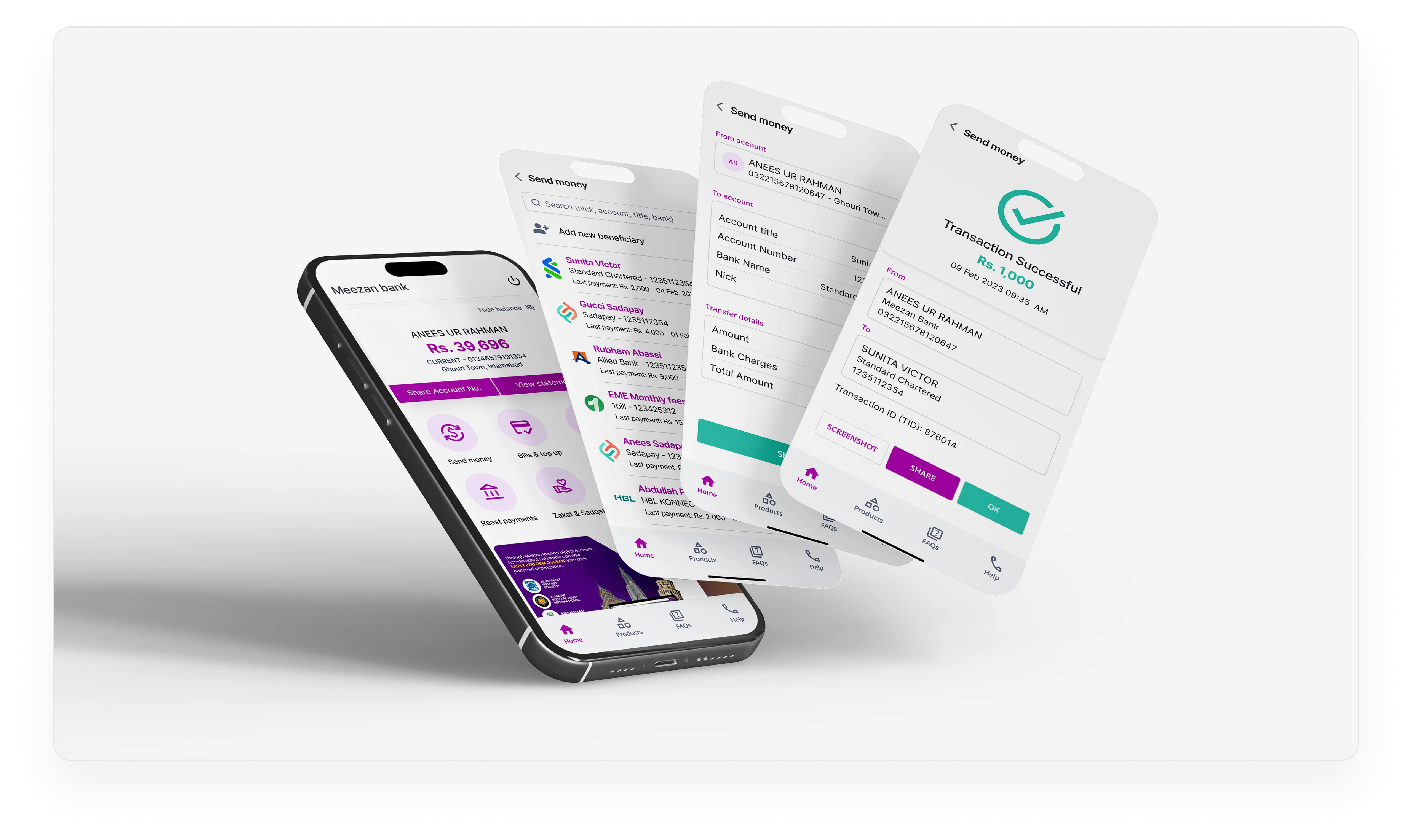
Frictionless Payments
Reduced the "Add Payee" and "Transfer" friction from 7 steps down to 3. We replaced clunky dropdowns with a visual, avatar-based horizontal scrolling list for frequent payees.
Native Authentication
Integrated native biometric authentication (FaceID/TouchID) directly into the payment flow to remove password friction while maintaining institutional security standards.
Self-Serve Controls
Empowered users with sleek, immediate toggle switches to freeze cards or adjust spending limits without needing to call customer support.
Systematic Scale.
A banking interface must scale across hundreds of edge cases. I built a rigid, token-based design system in Figma to ensure developer handoff was seamless.
Systematic Scalability.
A banking app cannot rely on static screens; it requires a robust, living ecosystem. I built a comprehensive UI Kit in Figma, ensuring developers had precise rules for typography, component states, and spacing.
Numeric Typography
Financial data demands absolute clarity. We implemented tabular lining font features to ensure that account balances and transaction rows align perfectly on the decimal.
Accessible Touch Targets
Every interactive component was rigorously tested to meet the 44px minimum touch target standard, ensuring frictionless usability for all demographics.
Measurable Impact.
The 16-week redesign successfully transitioned Meezan Bank from a legacy utility into a highly competitive, modern fintech experience.
Screens Delivered
A complete end-to-end mapping of the application, from KYC onboarding to secure biometric fund transfers.
Cognitive Load
Achieved by stripping away aggressive legacy colors and instituting a minimalist, high-contrast visual hierarchy.
WCAG Compliance
Ensured the interface was fully accessible, maintaining strict 4.5:1 contrast ratios across the entire platform.
Building the Foundation.
To ensure seamless developer handoff, the entire 30+ screen architecture was governed by a strict, token-based design system in Figma.
Semantic Color
Established a strict color logic where Meezan's signature Magenta dictates brand presence, while distinct secondary tones govern success and error states.
Brand Evolution
Before & After
The Neobank Evolution.
Over the course of 16 weeks, we successfully dismantled a cluttered legacy system and replaced it with a sleek, user-centric financial tool. By prioritizing biometric security, minimalist data visualization, and frictionless transfer flows, the new Meezan Bank app stands as a premier digital experience in the Islamic banking sector.
Learnings
Banking redesigns reward restraint. Every clever interaction we considered was checked against a simpler version of the same task — and the simpler version usually won. Trust accrues from being predictable, not delightful.
If I were to do it again, I'd invest more time in offline and edge-case states up front. Customers judge a banking app most harshly when something goes wrong, and those failure moments deserved as much polish as the happy path.